One subject
If you need a caption to explain the image, it is already too complex for the grid.
Playlist grid branding
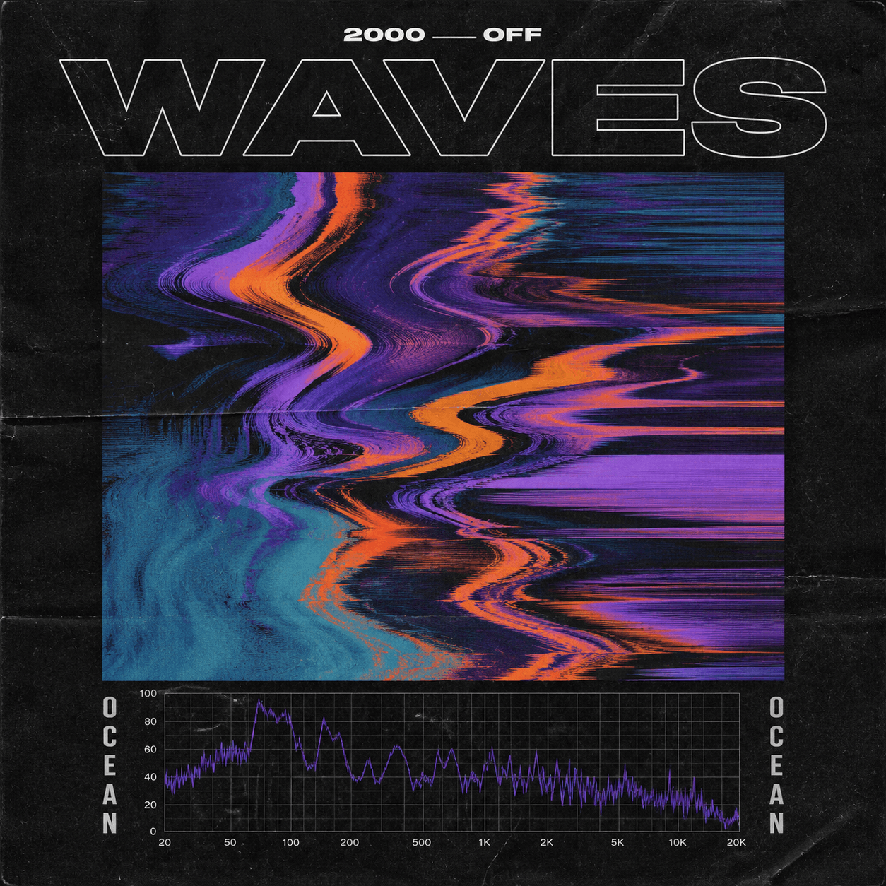
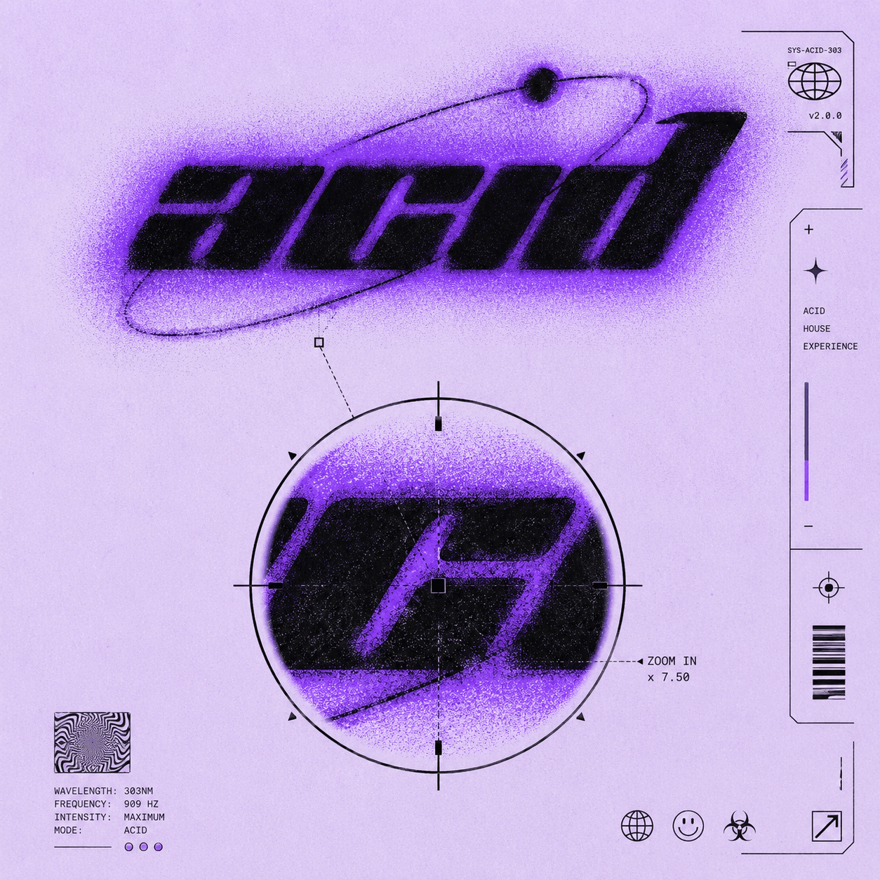
Playlist covers live in a ruthless grid. Design one icon-like idea, not an album novel. Name the playlist, pick a mood pack, then generate a square that stays readable at sticker size.
Jump into the workspace with your details. Sign in only when you generate.
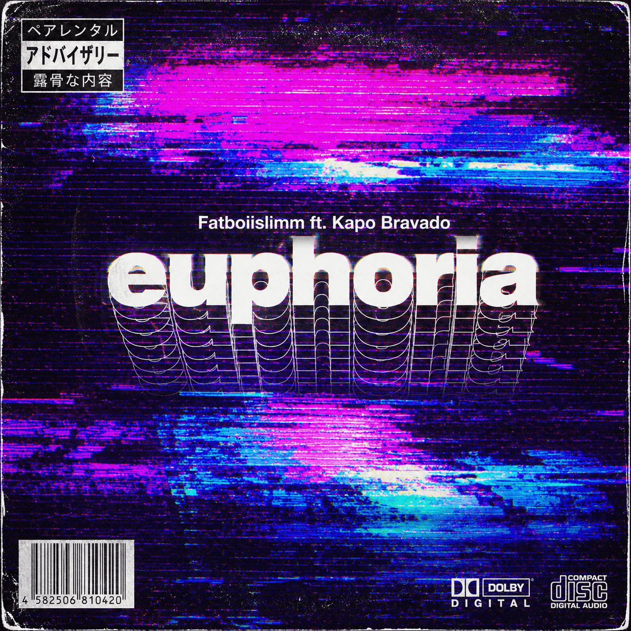
If you need a caption to explain the image, it is already too complex for the grid.
Spotify UI is dark. Light edges or a bright core help the tile pop.
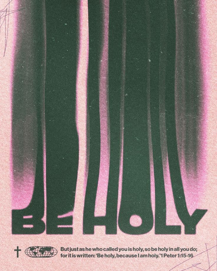
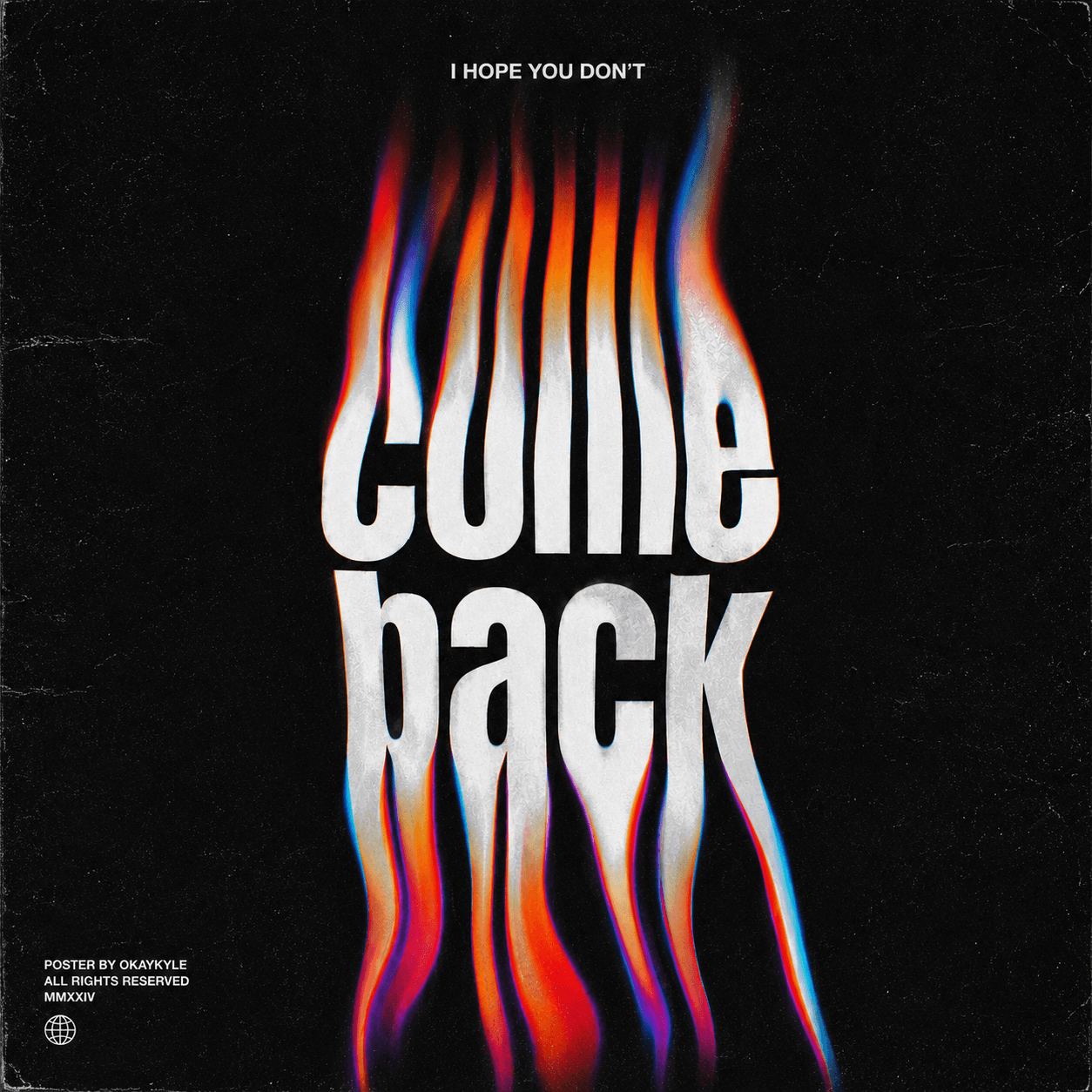
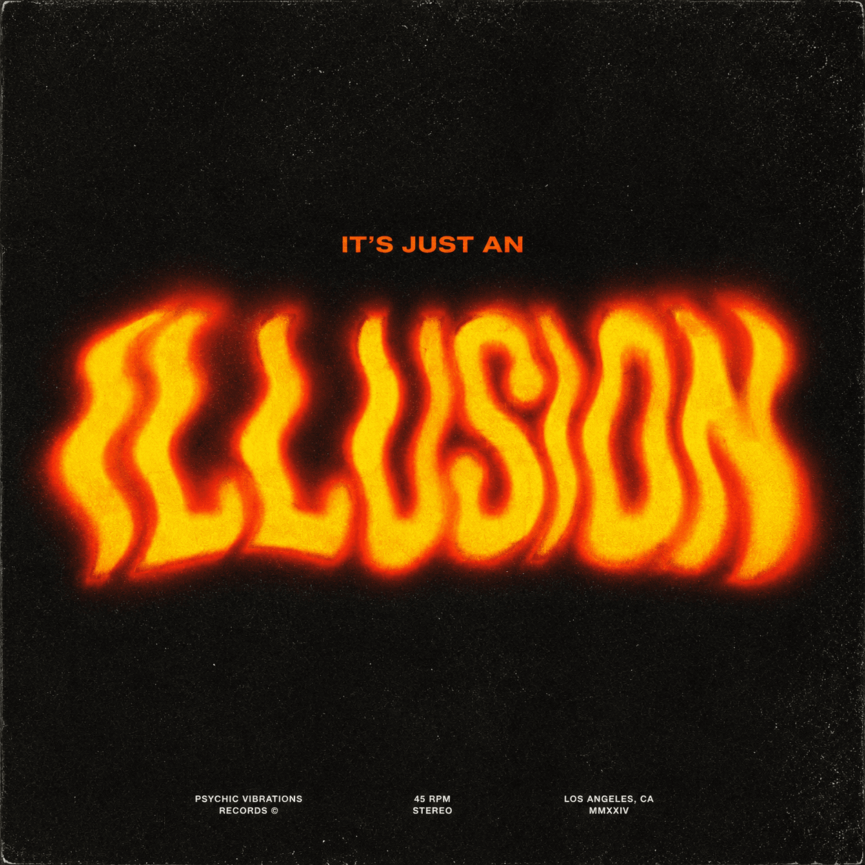
Many strong playlist covers skip words. If you use text, keep it to 1–3 words.
Related playlists should share palette or frame so your profile looks intentional.
| Pack | Palette | Motif |
|---|---|---|
| Night Drive | navy / sodium orange | wet road light streak |
| Deep Focus | ink / pale mint | single desk object |
| Gym Voltage | black / warning yellow | hard geometry |
| Heartbreak Archive | dust rose / grey | empty chair / window |
| Sunday Reset | cream / soft green | plant + paper |
| Afterclub Fog | purple haze / chrome | blurred figure |
FAQ
Square. Generate a clean square and upload it in the playlist edit screen.
Same shape, different job. Playlists need icon simplicity; albums can carry denser narrative.
No. Spotify already labels the playlist. Visual recognition often beats stamped text.
Jump into the workspace with your details. Sign in only when you generate.